Project overview


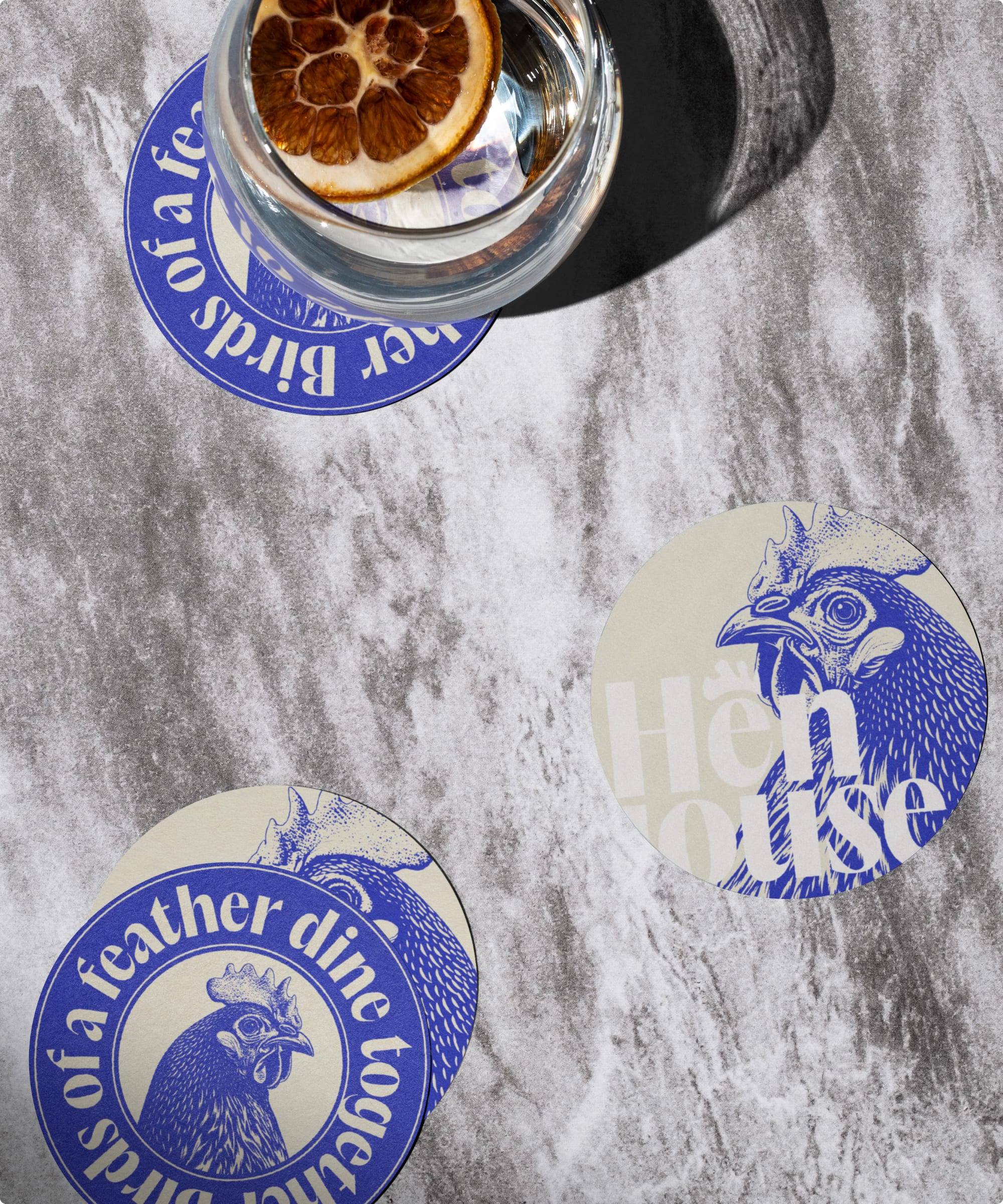
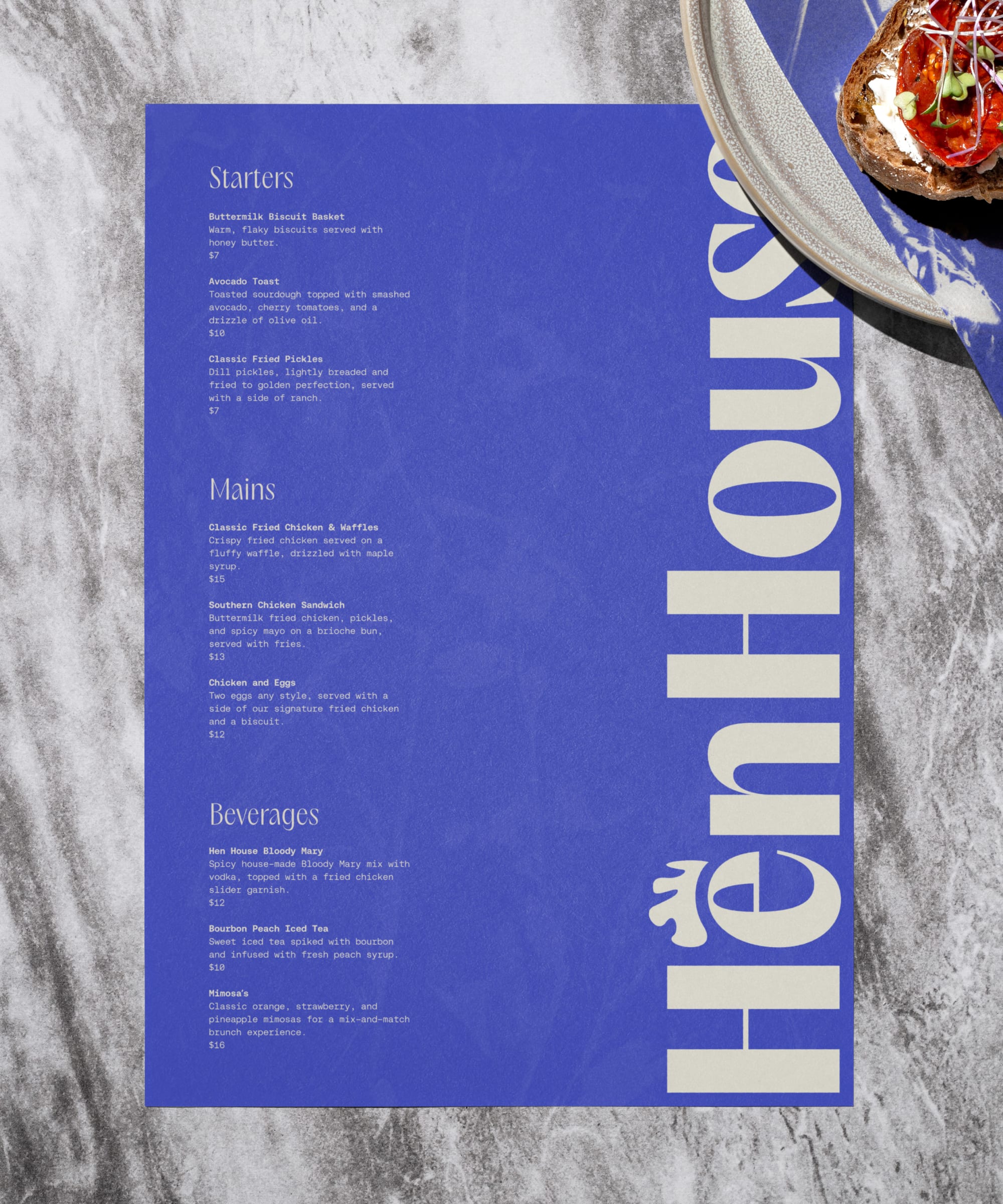
The visual strategy centers around incorporating playful chicken-themed embellishments that reflect the restaurant's signature dish while adding charm and character to the overall identity. A bold, unexpected color palette was chosen to create a striking visual contrast, setting Hen House apart from traditional brunch spots and evoking a sense of fun and sophistication.

We created a cohesive set of brand collateral for Hen House that spans across various customer touchpoints, from building signage and menu design to business cards and custom wax paper, all unified by a clean, modern aesthetic. Each piece is designed to be bold and visually striking, ensuring the restaurant’s identity is cohesive and attractive, enhancing the dining experience from first impression to final bite.


our Role
Brand Strategy
Naming
Visual Identity
Brand Collaterol
Collaborators
Hen House
Industry
Restaurant
