Project overview

After interviewing the new resort owners and key stakeholders to fully understand their vision, we developed a strategic framework centered around their goal of transcending traditional tourism. They wanted to create a destination that offers a deeply transformative experience, one that connects with guests on a personal level. The brand idea, "Rise Above," inspired a narrative that positioned the resort as a place where guests could return as a different version of themselves—ready to embrace the world with a renewed spirit.
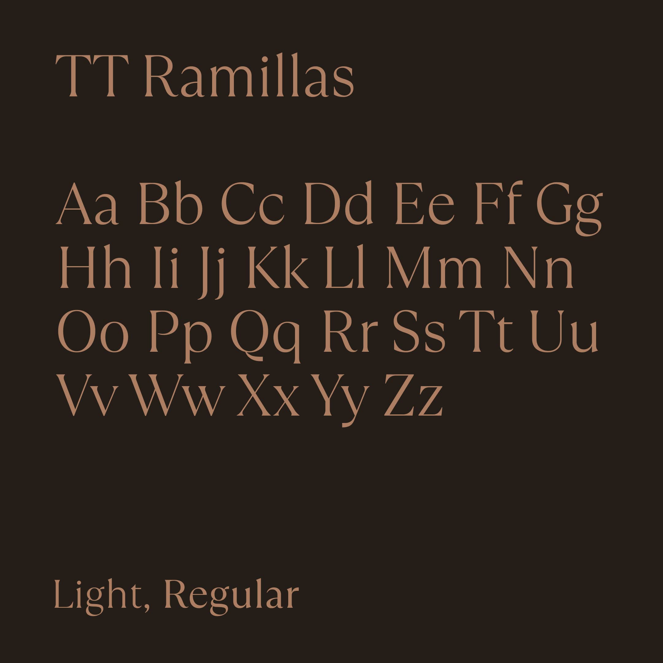
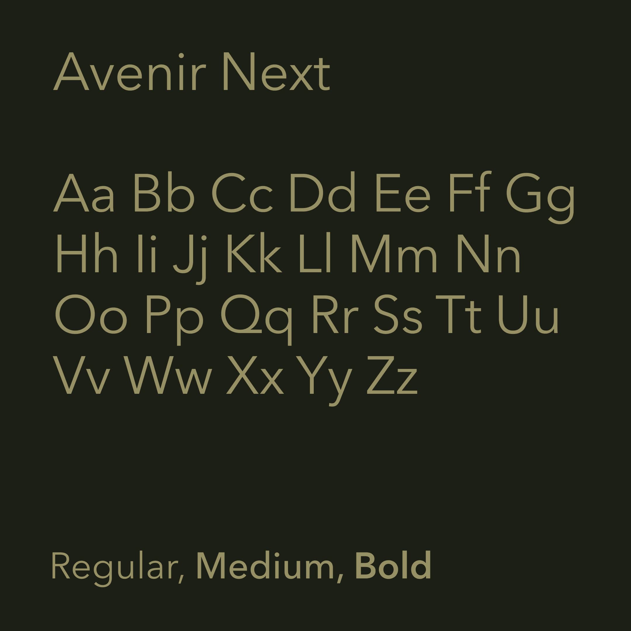
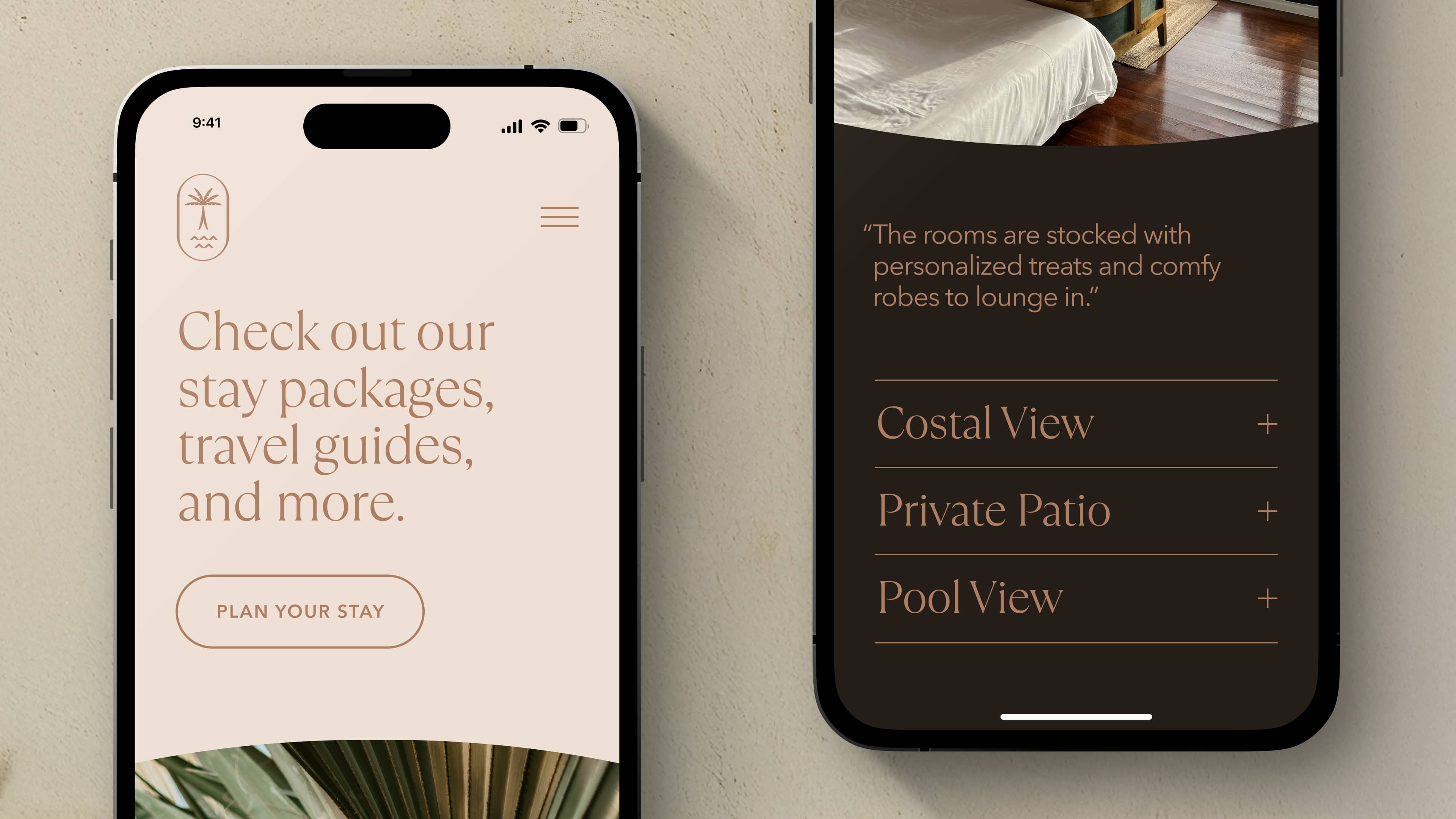
We developed a fresh typographic palette for Ascension that reflected the resort's beauty while embodying the simplicity and clarity our audience craved. We selected two distinct typefaces that paired seamlessly, each offering unique tonal qualities. TT Ramillas strikes a delicate balance of thick and thin strokes, and its beautiful letterforms make it ideal for larger headlines that command attention. Avenir Next complements it perfectly, serving more utilitarian functions—such as smaller settings of longer passages of text—optimized for legibility while maintaining a timeless sense of sophistication and grace.


Drawing inspiration from the natural surroundings and landscaping of the resort, we developed two distinctive and versatile color palettes. We wanted to create a balanced mix of warm and cool tones with similar tonal qualities to ensure unity while providing flexibility across various applications. Each palette includes light and dark chromatic options, along with two vibrant hues to create contrast and infuse designs with a dynamic yet natural color approach.
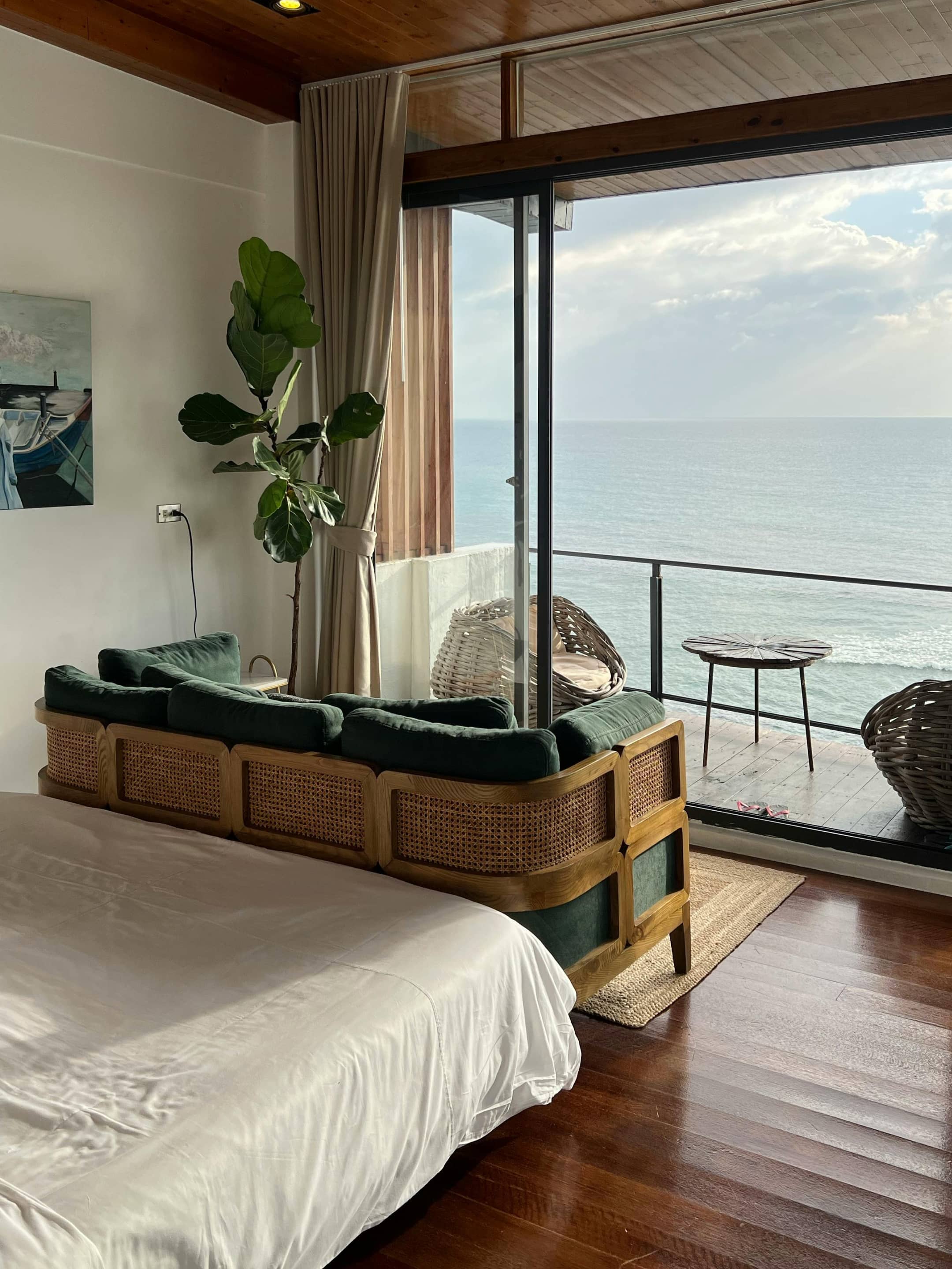
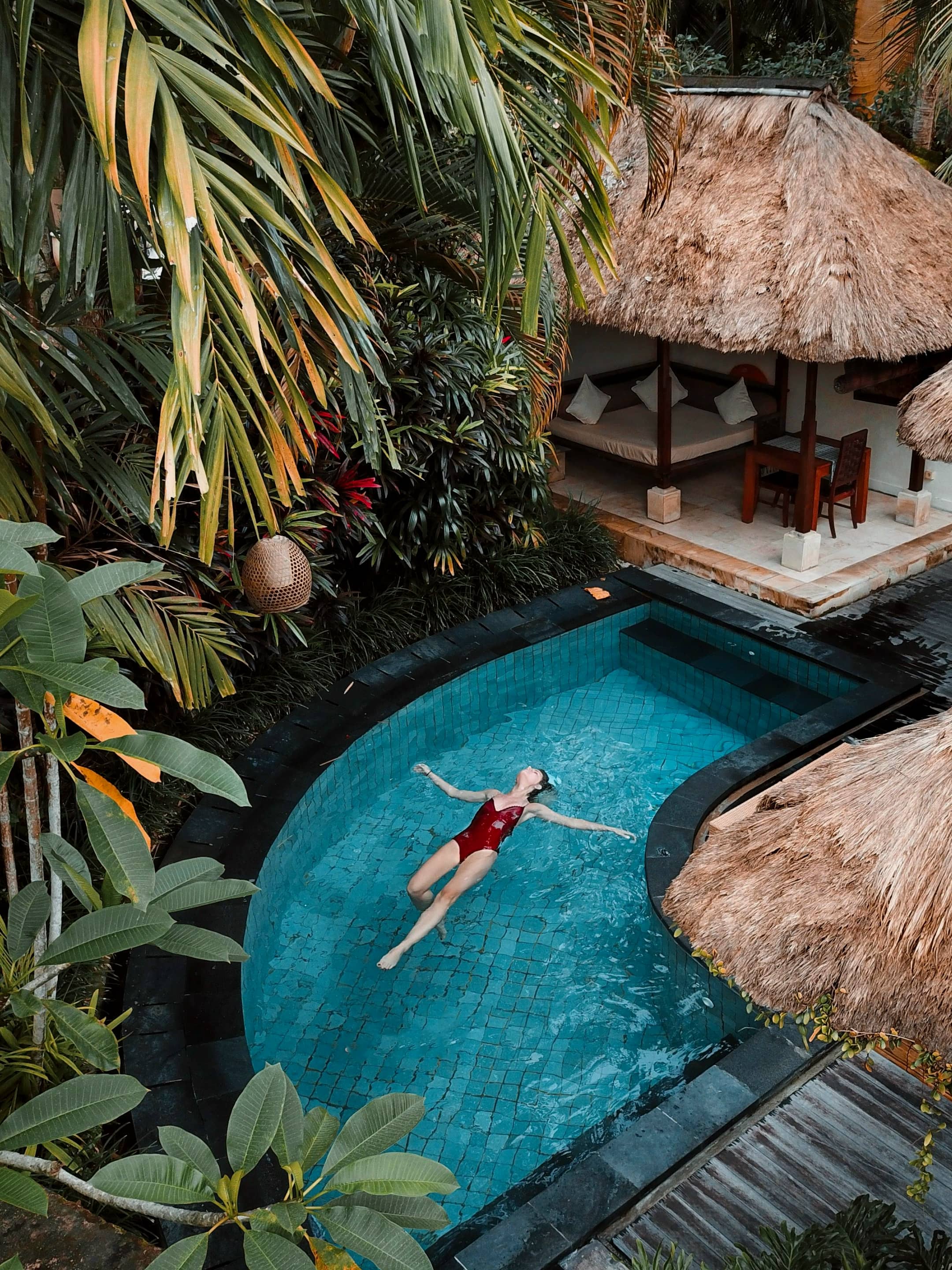
When presenting the resort through photography, our goal was to ensure the imagery resonated with our audience. We achieved this by humanizing the resort through carefully cast photoshoots, making the location feel alive and lived-in. It was also essential that the relaxing atmosphere and our transcendent brand idea were reflected in both the locations and art direction. Natural elements and landscaping played a pivotal role in creating the fresh, organic feel of the imagery, while the models’ introspective appeal added a layer of depth.
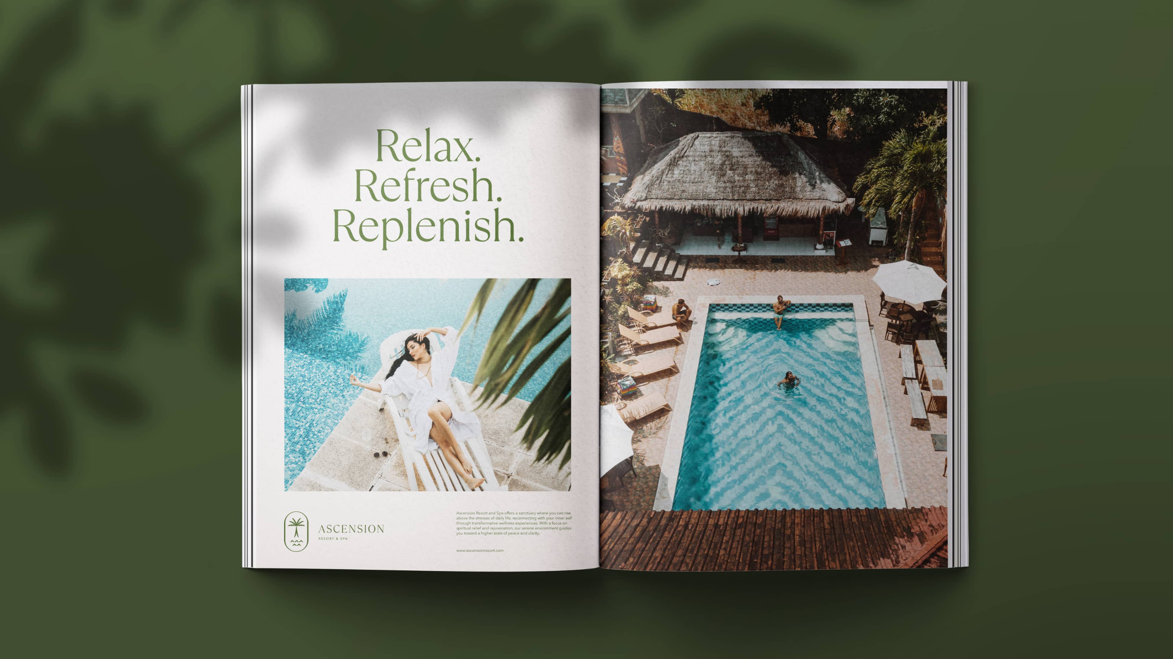
To ensure all our communication felt unified and contributed to a larger story, we developed the voice persona of the "Radiant Healer." Through this character, we established a consistent tone of calm, supportive, and soothing reassurance across all messaging. Building on this persona, we shaped the brand’s narrative around the core idea of "You’re Worth It"—aimed at connecting with those seeking relaxation, renewal, and a deeper connection to themselves. We crafted messages centered on themes of self-worth, inner peace, well-being, and mental restoration.
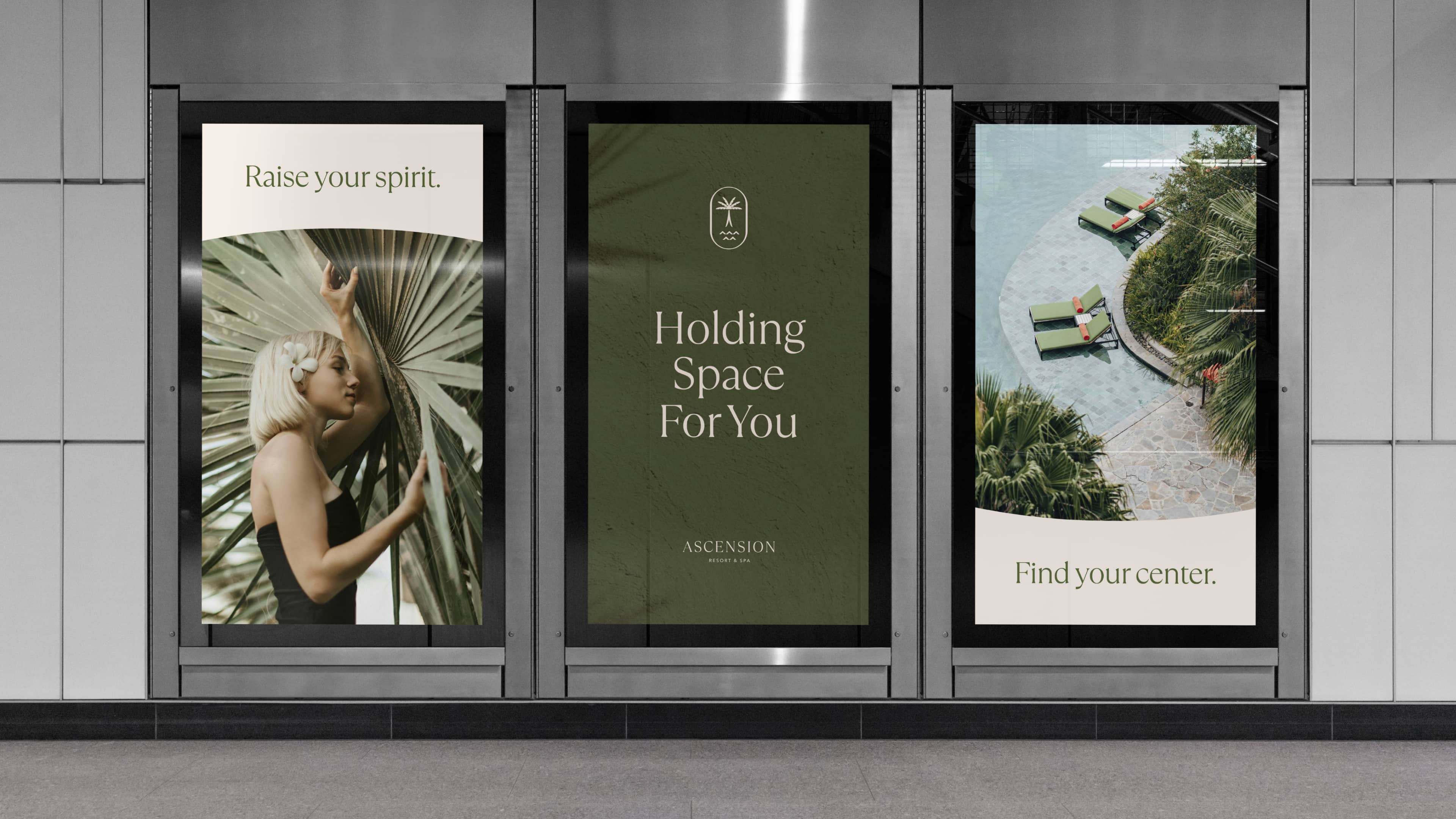
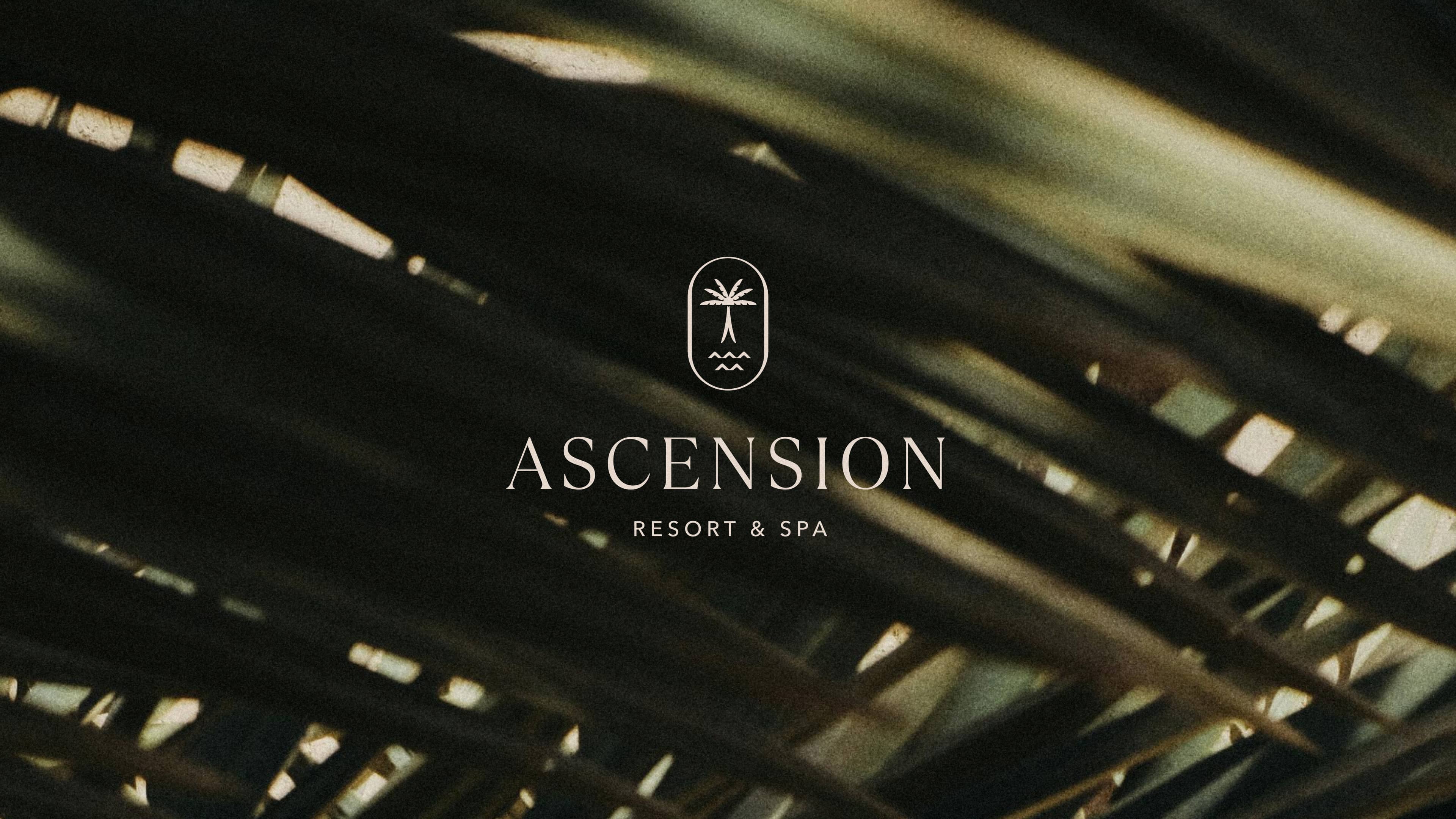
Ascensions brand mark is all about simplicity, distinctiveness, and memorability – the key ingredients for a strong graphic symbol. The “praying” palm leaves and natural elements symbolize Ascension’s commitment to lifting the spirits through a meditative and naturally inspired resort experience.
our Role
Brand Strategy
Naming
Visual Identity
Verbal Identity
Collaborators
Ascension Resort
Industry
Hotel & Hospitality
